Search This Blog

Friday 23 December 2011

Changing Identity

I find it helps to see more clearly if I stand back. To let go of preconceptions, opinions, likes, dislikes. Detachment gives an objective view. Those that move away from their home or have moved into a new community often have a different way of seeing to those who have grown up and lived there all their lives. Through the ages locals in communities have struggled with new comers and their new fangled ideas bringing about change. If you place your identity in a person or in objects then what happens if they are taken away?

Exposure. A feeling of dissociation, of being excluded. Loneliness and loss.

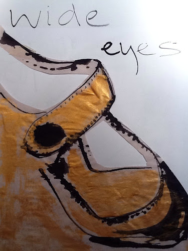
If I take my haptic hat off, what is left?

What now defines me?

Vulnerability in a culture where that is seen as weakness can be difficult to manage on a day to day basis. We are expected to be strong, to maintain a stiff upper lip, to be able to manage, not to rely on others, we are proud and defiant. We are frightened of the unknown. We have forgotten what its like to learn to try things for the first time, like our children. We expect to be able to buy so much readymade, off the peg, we expect to borrow our identity from the culture around us. But aren't we supposed to lead the culture around us? Shouldn't we be expectant rather than expect?

Do we really know what it is that we want while we hide at home with our in-house entertainment systems spoon feeding us popular culture?

This is fundamental to change in communities, people invest in communities for lots of reasons, physical: to have a better quality of life, work: to have more opportunities, relationships: with the people you want to be with.

So if your job changes, or the local authority rebuild some part of the physical landscape or your key relationships begin to waiver then you start to feel threatened and may become defensive even aggressive. Some will see differently and see opportunity, others will not.

Which are you?

Saturday 17 December 2011

Translating art from the mind into reality is an art.

The process of realising a piece of art is for the artist a both a very private and public journey. To know what it is that you want to do or make can be one of the toughest choices, many artists are good at several ways of expressing themselves visually, so from diversity one must choose direction. Its fortunate if it just evolves for you but more often it has to be an active and informed choice, that is, you have to take stock and look for connections following through your work, recurring themes and for a time those connections haven't had time yet to develop or be seen so there is a period of trying and trying lots of things or a sense of 'lack' of direction even though you have to produce work in order to retrospectively see where connections are made. You have to have faith in yourself and your work as one entity.

In my limited experience so far of public art this is a real challenge. Every part of the process from concept to physical piece you are required to justify, sometimes even pushed to fight for your original vision to remain intact.
Inclusivity is a key buzz word for application forms. But how inclusive is it for the artist? you have an idea, propose it, gain support, build relationships and confidence and then permission to go ahead hinges upon opinion. Judged on reputation how do you begin? The answer? With balls. Front, a quiet but steely conviction that what your proposing is a good idea. Note to self I must research other public artworks and their originators....just as I would look at other painters.

It's a great opportunity to grow in confidence but a challenging one. On the one hand it's simple, choose your piece or project be clear about it's aims and stick to it.

The hard part is sticking to it, testing every move against those first principles to see if they fit within the concept add or detract from the original. This happens a lot and even if you are calling a manufacturers....they immediately begin to explain how their product works and that it might be different in the circumstances you are suggesting....or the time frames don't fit funding, planning permission has to be sought etc etc...

Translating art from the mind into reality is an art.

Questions I must address:
Do I want the Big Flag pole above all else?
Do I want the community project? How much?
What is it exactly?
How can I make it work in the current cultural and political landscape?

Monday 5 December 2011

Checking out Warhol 10 - get the message?

Checking out Warhol 10

Portraits of others
Speed dating style
Looking at colours, emotional response, choice of number of colours. I thought I would try listing an emotion for all portraits in the gallery. As usual I am a bit over ambitious!
I got as far as the Mao series and found it quite a challenge recording for each my first emotion or impression the colours used and for what ie the background, the face, the shirt, highlights.

But by doing this I found it much easier when back in the studio to focus on those aspects of a face. I was really pleased with the portraits I did today and I think all of us felt like all the things we have covered in the last 9 weeks came together and we made some really authentic Warhol-ish portraits of each other. See photos I did Cheryl, Brenda and Sharon.

I have really had to focus on the message and quality of line in this course which has taken a while although I knew it in my head, actually doing it has been a challenge. I found my instincts are so strong to make certain marks and in a certain way that to use a limited number of flat and instantly unappealing materials was a good discipline and helped me move beyond the 'normal' for me.

This has been echoed through the need to fill in applications forms for the Inspire2012 Mark logo and funding for the Big Flag. Focus again has been key, communicating a message in a direct way. Also baring in mind what the particular Criteria are for that form. This is less important for art in progress because I don't have to worry so much what people think, however communicating the concept of a piece of public art has so fat been different and needs to be framed and delivered in the appropriate context in order to avoid confusion and hidden agendas challenging the original starting point or subject.

All art moves on through it's development however when the opinions of others have to be sought in order to gain permission or recognition from valued sources it becomes vulnerable to such dramatic change that it can be unrecognisable, then it loses vision, direction, clarity, purpose and ownership.

The location of the Big Flag is now under scrutiny and is being seriously challenged. My challenge is to hang onto my vision and to stand fast for the clarity and purpose of the public art piece at it's heart.

Sunday 4 December 2011

Checking out Warhol 9 orchid or alien?

Using photoshop to alter image, this was an orchid which I cropped and stretched then altered the colours on. One of the images flipped while I was working on it, due to my lack of experience! But I liked the way it just lined up with an arc into the next door image. I tried to repeat this but the layers on photoshop got the better of me in the time I had left!

Some of us worked on computers some on collage.

Firstly we looked at flower prints in the gallery, looking at colours, overlapping and edges. Small details say a lot about the feel or weight of an object. Warhol said a lot about the chosen image by NOT saying a lot! What do we leave out? I really like Davids blobby cut outs on blue, they are intuitive shapes he created which have a lively sense of movement and floating, petals, eyes, cells...lovely.

Focus on flatness and smoothness of Warhol's work. Looking at quality of line, the way see shapes, simplify.

Mine are the 'sale stickers' flowers, by using dayglo paper it gave a feel of cheap pound shop price sticker! The large pink and black positive and negative is also mine, more waitrose I think!

Task: Drawing with scissors looking at images of flowers, notice edges or take a small section. This made me
think of the silhouette artists in Montmartre who, in a few seconds can capture the profile of a sitter with scissors and black paper, try it, it's really difficult!

Task: altering an image using photoshop.
Using basic photoshop tools we edited images and experimented with colour changes and how they affected the viewers perception of the object.

Thursday 1 December 2011

Identity- who am I?

A two way process

Messages travel outwards and towards

Movement and time

Perception of self and others perception of me

Edges meet and separate

Two sides can harmonise or jar

Two colours compliment and vibrate

Two colours appear dull and lack energy

It's not really about opposites although that can crop up as two sides are placed in relation to each other it's more about understanding the relationship between one side and another and identifying the space between. Understanding me.

A sliding bar representing me moves depending on who I am with, life experiences, context, emotion, confidence, skill, external influence, physical and mental wellbeing, affluence, cultural capital

The bar remains constant

Another way of representing this bar is a flag pole, looking directly to the Big Flag project I am working on as a source of creative identity at this time.

I am the flag pole and various flags fly from me depending on external influences as listed above.

Tension between external influence pulling at the pole in the wind, the pole must be placed with firm foundation and remain constant. The flags of influence vary in colour, texture, shape, weight, heavy burdens will hang down and need the strongest gust to fly sometimes these are the most rewarding to see, their rarity and struggle evident in the way they test the pole's strength the most.

During the process of developing the project I have strong feelings of exposure and vulnerability, being challenged constantly about choices regarding making my mark and staying true to my vision. Meeting opposition and other agendas face to face, not being pushed off track.

Potentially crushing personal experiences such as the threat of appearing unprofessional, accepting outside support and issues relating to communication or persuasion amidst hidden agendas, together with feelings of fear and inadequacy are tempered with overwhelming positive response and a deeper growing ownership of the concept. Finding the space where fear and confidence meet. Integrity and humour.

This is the visual journey of thought.

These last experimental images are about two sides coming together to create a larger sense of myself identifying the space between.

Sunday 27 November 2011

Checking out Warhol 8 message and colour

Checking Warhol 8

In this session we were looking at topical images in newspapers, following a theme. This relates to Warhol's years in advertising. A grounding that must have informed his use of colour and direct communication.

So we cut out a series of images relating to the theme of our choice. Out of these we made a montage about A2 in size, this was then photocopied and we worked into each copy with colour, bearing in mind Warhol's use of colour in the electric chair series in gallery 1 of the De La Warr Pavilion.

I chose threat and death, nice cuddly subjects! Inspired by the 90ft wave that a surfer successfully rode just off Lisbon. I read the article feeling physically sick with fear even though I knew he survived, a powerful story that i didn't manage to do justice to in the language of collage.

So the task was to think of a system for displaying images - ironically I forgot to come up with a system and just collaged them together, but of course I did actually have a system of a kind in my head. I do a lot of collage so am used to playing with images on a surface, balancing shape and form though have to say this was a bit different perhaps due to the time constraints but I think mostly to the fact that I have been used to working with abstract images not messages. Mmm gotta think about this and incorporate it into my work process.

This catches me at an interesting time in my professional development as I had a portfolio review last weekend and it is becoming all too clear that I have a magpies eye for the visual. I am someone who naturally finds it tempting to go in many directions and what will help me now is to choose a focus or more importantly let one emerge from the work that I have already got . To do this though I will have to stop and reevaluate and then test out what paths come to the fore. I think I might have been resisting this because I prefer to remain on the edges (where failure is less likely ) never quite succeeding because I haven't quite committed. So with the Big Flag public art project almost ready for take off I am going to have to do this very thing! coming soon a post about me as a flag pole.....

Communicating with the outside is hard enough but communicating with yourself is the trickiest.

How do I associate colour with the images.

Select one of the images and draw it, I chose one of a massive crowd waving flags. I used black and yellow, thinking about the sense of foreboding a big crowd carries, danger, threat, unstoppable energy etc...

Picasso's guernika is a very powerful political message
Using a limited palate communicates more to the viewer.
More colours confuse the message

A Rolling stones face looks like a pink skull, what does this make you think of?

Images of women being nothing else other than beautiful not reflecting who they are.

Thursday 17 November 2011

If the shoe fits....

My shoe collection:

Checking out Warhol 7 - you can lead a shoe to water but you can't make it drink.

Checking out Warhol 7

Task: Make a shoe drawing with a comment then keep doing it as many times as you can with different shoes.

As Warhol had advertising in his blood there is usually a strap line for each drawing. He obviously loved shoes and what they represent, convey, how they make you feel, attachments, memories, associations, glamour, statement.

Look at how Warhol drew, biro, pencil, no perspective, flat, then compare the black boots in gallery 2 with the shoes in gallery 1.The shoes in gallery 1 are expressive and definitely convey something of perhaps the character of the person who would wear them, but not Warhol of course! I love the fact that everyone has a favourite pair of shoes...they are unique in our range of attire options they are rich in association and carry all the marks our wear and tear. They are often quite literally pounded with our personality. The paratroopers black boots in gallery 2 are heavy and appear shiny, very graphic black and white they are made to feel even more grounded by the paratrooper landing from upper left. They are polished for purpose and represent a nations combative pride. Not much change there then.

What is the personality of the shoe? Show somehow what is the shoe saying to you? Aha again one of these 'that sounds easy' instructions that defy all logic. It's fairly easy to convey something about the shoe but to get the image the marks the colours and some text that all work together is not something you can just knock out.

His dotted/blotted line drawings derived from Ben Shahn, he used paper hinged and then printed in sections before ink dried. This was his illustration technique for shoes whilst working as commercial illustrator at I Miller. A few of us tried this and it was moderately successful, our paper was either too absorbent or too repellant and the ink may have been a bit thin, however the process of attempting to replicate someone else's technique was interesting as what happens is you begin to experiment with your own variations.We got to experiment with ink and kebab sticks to try and replicate the genius at work! We made as many drawings and prints of each others shoes as possible in 2 hours, they were amazing! What also really helped was seeing other students trials and prints and then experimenting further.

As an artist work can be quite isolating so attending courses and actually working alongside others is a really useful way to broaden your ways of seeing. Inspiration is infectious when artists work together and even if people have very different experience levels there is always something to learn and take away, when we create we take risks and it's these risks that enable brilliant accidents to happen. Do you take enough risks? Do you choose your shoes carefully?!