Search This Blog

Monday 31 October 2011

Do you have a flag?

I have surprised myself by coming up with an idea for an installation. I am in the process of achieving it and my learning curve is about to shoot through the roof! It's an idea that has received positive feedback from Rother and Hastings but still needs more work on the format and a budget worked out. The timescale is almost too tight but I cant help thinking that if we gave up on everything because of that, nothing fantastic would ever get done. All comments welcome!

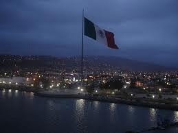
Big flag installation.

The aim of the installation is to deepen the community cultural ownership and enrich the creative identity of three towns, Bexhill, Hastings and Eastbourne both locally and nationally by using a focus point that the local community can relate to and own. Influenced by the internationally acclaimed Warhol is Here exhibition at the De La Warr Pavilion, inspiring the notion that Bexhill is Here, The Big Flag will both enhance the landscape, harness the local climate culturally and geographically and be a point of welcome and symbolism for people from other countries.

Each installation will be a big flag, scale is crucial to the visual integrity of the installation evoking a sense of time, ambition, success and national pride. Scale of identity and weight of ownership will be reflected in the movement and size of the flag.

The flag will draw together many foundational elements of the locality such as maritime and military, regal, historical and global links.
As Bexhill, Hastings and Eastbourne are all Coastal towns with significant cultural organisations and historical identities I propose that there are three flags installed one in each town, the flags will amalgamate these common strands not only reflecting the identity of each town but also the cohesive arts identity of this section of coastline.

In this cultural Olympiad the sea is an obvious physical link to other countries. As an historic sea fairing nation the south coast reminds us of the physicality of connecting with the rest of Europe and the world, this edge creates an opportunity to signal a positive message of welcome as flags have been used throughout history and to remain in the future as a marker of our hosting the 2012 games in the Olympic spirit.

The Olympic torch will be travelling from Brighton on the 16th July and staying overnight in Hastings on 17th. As the torch travels its presence will be highlighted by the flags and the memory of it will be embodied in the flags thereafter. They will also tie in well with wooden boat project.
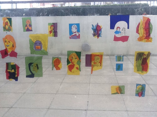
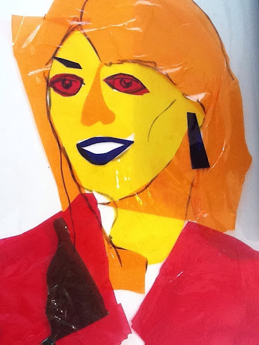
Design of the flags will be a result of local research and the content will be led by voluntary contribution from each community. It is anticipated they will be a fusion of local organisation colours and those of the Union flag. The design process will be artist led through local consultation and workshops.

Unfortunately I don't think the torch bearers will be dressed quite like this in 2012 but you never know!

I have spoken to a flag company at some length to work up more details and costs. So far the 'ideal scenario' costs are around 7 k for pole, flag manufacture, delivery and installation. Though it's all informed guess work at the moment. In addition professional fees and costs of workshops and research with local groups might be around 10k plus publicity.

I am wondering whether we can commission a piece of performance music based on signalling and semaphore to go with it but this may be one idea too far!

Monday 24 October 2011

Capitlist realism

Gerhard Richter Tate Modern

Gerhard Richter was a contemporary of Andy Warhol, he rejected the expressive abstract art of the time and worked from photos or magazines, travel brochures. He called his practise 'Capitalist Realism' his subjects were luxury items or everyday objects he was also later influenced by news items such as the twin towers bombing and historical political figures such as the Baader Meinhof group and the Nazis.

I am interested by how he was affected by other artists. He saw Duchamp's work and then through his painting of Ema distanced himself from Duchamp's claim of the limitation of paint. in Ema he created a sensitive work depicting his wife i wonder if the fact he rejected drawing for the most part suggests that he simply used paint in a direct way, he was very skilled at its manipulation and therefore you could say his paintings were elaborate drawings.

Boyce made his Fat chair and a year later Richter responded with Stool in profile 1965. He adopting the colours of 60's common in the Pop art movement through his colour charts and set a contrast to the colour harmonies used by Bauhaus artist Josef Albers.Richter slightly confuses me as he preferred to make work without feeling or emotion in a mechanical and ordered way. Yet some of his work appears gestural and sensitive. I particularly like his graphite drawings from 1990 in room 11. There are not many and it seems that he wasn't a fan of drawing for a long time, he is very good at it, both representational and abstract.

Walking round 'panorama' feels a bit like I am wearing someone else's glasses; many of Richter's paintings are blurred deliberately afterwards with dry brushwork, this gives a sense of movement and obliteration. Covering up is a key element in his work eg table. 1962. This interests me as I cannot help covering up elements of my work. Though his method is more about distortion than blocking out. The idea that the layers cannot work individually but blend to create a vibrant surface.
This is also seen in his glass installation made of 6 panes leaning against the wall, reflections in them change depending on what is seen on their surface and the layering of the glass obscures the edges of subjects. I squint to try and focus! Yet his mirror piece is the antithesis. I feel uncomfortable looking at it as it's very clearly me reflected.

Richter has always posed questions about vision, asking whether perception enables or confuses our understanding of the world. (Tate exhibition booklet)

The work that resonated with me was in room 13. In 2001 and beyond he made several quite small paintings on aludibond. To me these are each both drawing and painting in one. The marks made by the paint and in the paint, the 'leaving out' creating space and time for me to draw lines in my head and read into each surface that which resonates with me is exciting and I have an immediate connection. I like that there are three, their dimensions, materials and execution all balance and cohabit the wall in harmony. This where the energy and life of the exhibition is for me.

I think I want to explore working with 3 images, triangulating a particular point. To try and define that point through the relationship and connection of the 3. This could be from figurative or landscape subjects. Haptic and performative.

Tacita Dean
Film in turbine hall, this is massive. I would call this a moving drawing it brilliantly plays with image and colour, space and time and it's scale and method of production is staggering. Go and see it. I am not familiar with her work but really liked this.

Jerwood drawing competition.
I also visited the Jerwood Space drawing competition, which quite frankly I found dull, due to the prevalence of pencil drawing. Come on! This is 2011. But two pieces saved it for me, one was a piece of performance drawing on video of two people lying opposite and touching at the knees and head and both drawing in the space left between them, it created an intimate and expressive peice of work that clearly had a relationship to. The bodies and their proximity the energy between the different points was tangeable for example between the knees it was confined, sounded hard and was distant from the artists but between the face and groins it was was fraught with tension humour and sexuality, between the stomach there was most space and it was free and circular. Really fascinating!The other piece I liked was a drawing of the inside of a mouth, called Mouthful of triangles, it was drawn on the inside cover of a book and triangles collaged into the open cavity. I had a real sense of a mouth full of awkward shapes, it was fun but also clostraphobic, like my mouth was too full and i was choking. Haptic.

I tried to find the exact mouth with triangles in the show but cannot so here is one like it...in doing so I found out more about Sally Taylor the artist. There's always a silver lining. Or in her case a felt tip!

Friday 21 October 2011

How do I look?

Checking out Warhol week 4

Self portraits: Today we were looking at process without the end result being already decided.

Instructions this week
1 Make quick drawing of old fashioned portrait and note artist
I had a portrait of a young man by boticelli

Then go into the gallery and draw a portrait and compare with the first.
I chose warhol's self portrait from 1973.

This is an exercise in looking and processing what you see not what you think you see, it's reading the marks in front of you without letting your editing side take over and regulate.

Look at the difference...Warhol was more interested in the playful nature of materials and process rather than with giving a sense of character and personality. Although he chose the famous and often rich, he was doing it for his own process, not to the specification of a commission. The older portraits we copied were done for rich people and they would most likely have been in the fashion of the time and enhanced to please the sitter!

Does a portrait tell us more about painter or sitter?

Both ....But in my opinion it's more about the painter and how they see the sitter in the context of their life or the cultural and political time in which they live.

Picasso was an obsessive self portrait painter, it seems natural as an artist to start with yourself as the subject but these days it's often hard to know how you see yourself. We are bombarded with who we should be like and family life takes it's toll when time is generally spent on other people rather than on yourself. As a mum of three boys under 8 I am not only pressed for time but also outnumbered and outwitted by all the boys in the house!

I am in the frustratingly slow, life long process of trying to carve out time to develop my art practise, in prioritising my work and not feeling guilty, for example saying goodbye to a 3 yr old screaming 'mummy I want you' to come to the course this morning. I find it's hard to step from one world into another with ease or even grace! Inevitably I bring with me emotional baggage from home. Sometimes it's like a raging machine in my head that just cannot be switched off and what's needed is stillness and space before I can even think. My aim is to always work with what I have and so harness the energy in each situation. A day to day struggle but an artist has to have a struggle!

Excercise
Put your photo under acetate and collage cellophane over, then with black ohp pen colour in photograph bit....emulating Warhol.

Then on the OHP go round with a marker on big paper, then copy so you have four drawings from the original drawn from the acetate.

Looking at the process, moving away from first image.

Marks take on new identities and give drawings a different attitude, feel, strength. Surface takes on new possibilities and the work becomes something to look at rather than a window or mirror to the subject. There is a sense of time, journey, discovery, often struggle, commitment and all this gives the work integrity.

Tuesday 11 October 2011

Keeping a record

Checking out Warhol 3

Keeping sketch books is a great idea from so many stand points, it's a journey, a visual diary, a scrapbook, a record, a personal history reflected through visual, textural, textual, colour, line sketches, photograhs. A safe place to explore feelings, emotions and to discover your own creativity. Everyone's is different, each one of mine is different it reflects the time and context in which it was created. Most importantly I think keeping a sketchbook is space to think and work things out. It's like breathing if you are starved of air you cannot survive but if you breathe deeply and get fresh air with excersise you become strong and you benefit in every area of your life.

Andy Warhol was prolific, the exhibition at the De La Warr Pavilion is the biggest outside of London and Edinburgh but it still shows only a very small percentage of the quantity and range of his work and his obsession with recording other people's conversations is perhaps like an audio sketch book tracking creating a pathway which informed his choices, he often referred to the media or external influences to choose subjects, indeed they would come and seek him out.

The cows in gallery 2 have been puzzling some of us on the course and this week we discovered that the book Andy Warhol and Pat Hackett. POPism describes Ivan Karp suggesting to Andy Warhol (in response to Andy's searching for a subject) that he paint cows, a typical pastoral subject in much traditional art. Warhol's response is typical of his reactionary instinctive style, to do the complete opposite of whats currently accepted and elevate this 'pastoral' animal to extraordinary status using colour. Producing a quite frightening vivid image of a docile animal but in loud threatening colour shouting out from the paper. As wallpaper the impact is magnified. I think it transforms the walls into a colour field of horror, of subnormal even paranormal, of nightmares. I was interested to find this quote revealing warhol's insecurity regarding his public status as an artist and the celebrity he thought that should should bring.

Ted Carey thought that Warhol may have been more influenced by Jasper Johns' fame than his actual artwork. Carey would later say that "Andy was definitely influenced by Johns and Rauschenberg, not so much by their produced work, but by their personality and their success and their glamour and the fact that they were in the Castelli Gallery, and that's what Andy would most like to be." Although Warhol was keen to be accepted by both Johns and Rauschenberg, it wasn't until he achieved his own fame as a Pop artist that they befriended him. In Popism, Pat Hackett recalled a conversation in which Warhol asked Emile De Antonio why Johns and Rauschenberg didn't like him.

Andy Warhol (via Pat Hackett in Popism):

"De was such good friends with both Jasper and Bob that I figured he could probably tell me something I'd been wanting to know for a long time: why didn't the like me? Every time I saw them, they cut me dead... I finally popped the question, and De said, 'Okay Andy, if you really want to hear it straight, I'll lay it out for you. You're too swish, and that upsets them... First, the post-Abstract Expressionist sensibility is, of course, a homosexual one, but these two guys wear three-button suits - they were in the army or navy or something! Second, you make them nervous because you collect paintings, and traditionally artists don't buy the work of other artists, it just isn't done. And third,' De concluded, 'you're a commercial artist, which really bugs them because when they do commercial art - windows and other jobs I find them - they do it just 'to survive.' They won't even use their real names. Whereas you've won prizes! You're famous for it!... Yes, Andy, there are others who are more swish - and less talented - and still others who are less swish and just as talented, but the major painters try to look straight; you play up the swish - it's like an armor with you."
http://www.warholstars.org/warhol1/12dada.html

In the gallery this week, we chose one portrait. Made a small drawing, listing all the colours. Noting 'What do the colours transmit to me?'
Looking closely at edges and mismatches of print.

I looked at Joseph Boyce, seen in top right of image, which is a print over a print mismatched so that it appears Boyce is moving his head from side to side.
The colours are simply black and White with hand painted White beneath the black print, big gestural paint brush sweeps across the surface.
Hs big hat gives me the impression of stillness and solidity, his eyes are staring fixed amongst the moving fuzz. The black and White makes me think of laurel and hardy, films, of comedy, happy and sad, fear, unpredictability, danger, out of focus difficult to pin down, there is a softness created by the double print edge which also suggests transparency and maybe vulnerability or tenderness. The activity was to choose a portrait of someone we like or dislike and then draw them twice choosing colours limiting ourselves to 3 or less and trying to recreate a Warhol version of their portrait.
I found this incredibly hard, firstly to choose a subject and secondly to find a way of achieving expressionless flat colour, I discovered a little late in the session that perhaps taking a print of the painting I had done might have been a good way of achieving the flat print blocks of colour Warhol used but it was also difficult because I felt I was having to get into a way of seeing that was someone else's natural state and of course for me it's a forced state. For my own personal development this is really useful and I think I learn more from my struggles with new ways of seeing, now I am still chewing the fat over this method of seeing subjects and I will continue to explore it.

I chose Eddie Izzard who I really like and admire I am going to put the image into this blog because although I dislike it visually and and am very frustrated with it it did still have a sense of comedy and danger which I admire Eddie for persuing in his work.

Others on the course chose the following

Harold shipman
Margaret Thatcher
Steve jobs
Steven fry
Mary portas
Gary Cooper
Pierre marco White
Louise Mensch.
Friends or family.
Lulu guiness
Portrait by rodchenko

Next week we are tackling self portraits....will I survive?!

Thursday 6 October 2011

Checking out Warhol 2. An icon makes an icon out of an icon

Checking out Warhol week 2

What three brands do you have faith in?
I chose Innocent, VW and got a bit stuck! I guess I am not the kind of person who puts faith into a brand.....am I too cynical?

This week we looked at Warhol's graphic design style and branding.
We walked around the exhibition, starting upstairs this time listing all the packaging and brands in his work and trying to think of modern equivalents. We all found this quite a challenge but as soon as we got talking together later on it became easier as we exchanged ideas. Go have a look and try it for yourself.

So upstairs in gallery 2 our ideas were:

Hamburger - McDonalds
Dollar sign - perhaps now brand labels are more important than money itself? Or the euro.
The US Army and guns - the right to bear arms...the 'war on terror.'
Boots - trainers
Joseph Boyce, Maplethorpe and Julian Schnabel are posed like film or rock stars reminding me of Elvis or James Dean.
Coca cola - water bottle.
Cow - shark
Simon Cowel. Pedling american dream.
David Beckham.
Are you different poster - sexuality, race relations hot topic of the times.
Catholic black and white, right or wrong. Polarity of opinions and actions.
Map inter continental ballistic missiles - middle east nowadays war on terror.

So what is a brand?
Is it a projection of identity?

Downstairs in the main gallery
Campbells soup - Heinz
Brillo - Finnish, Cilit-Bang, Ciff or Fairy Liquid.
Marilyn - Madonna, Princess Diana, Amy Winehouse, Elton John, Simon Cowel
Grace Jones - Lady Gaga, Naomi Campbell.
Mao - Gaddafi, Saddam Hussein statue coming down.

The US were nervous of communism and what Mao represented. There was interest in why Warhol had made the choice of these particular colours in this series. Are we trying too hard to make sense of something that is completely random?

Formal visual language of colour and form is traditionally represented in art but in screen printing the form and colour are flattened. They take on a different feeling or interpretation of imbedded values.

The Marilyn icon is interesting: an icon, Warhol made an icon....of an icon.... an accidental repetition?

Warhol had a unique awareness for his time and was brilliant at holding up a mirror to life as it was happening he took a soup can and elevated it to be seen as art. This way the ordinary man or woman in the street and intellectuals complete with high cultural capital alike can debate it's merits. Warhols art is anti elitism and anti intellectual, instinctive but probably not intentionally anti. His work was observations of his time, if we look at those images now we overlay all our current up to date knowledge onto them and they take on more meaning than perhaps he originally expected.

This is where my comparison of Warhol to stand up comedians, observing life around us in a prophetic way, falls down as comedy with time does not accrue additional baggage but images do.
Do you agree?

Warhol has democratised art. No one object is more important than an other, in the past there was a hierarchy of high culture and low culture. I think there still is a belief in that hierarchy,broadly speaking, again do you agree?
Have we moved on or do most of us still believe that 'good' art can only be seen in galleries and collections acclaimed and written about by art critics?

Warhol was ahead of his time perhaps foreseeing peoples obsession with owning art products. His plan for selling hand printed giant Brillo boxes flopped when no one wanted to walk out of the factory with them.
Was he just a bit premature or did he just get the product wrong?
It was after all a huge economic boom time for the american dream why not expect people to follow every lead that he made?

Recommendation: Look up 'Revolutionary road.' A good book about a guy in advertising...also a film.

Pop art and maybe Brit art are more reactive rather than philosophising movements with manifestoes.

Look up Matthew Collins the Art critic on Facebook.

Task.
Think of a brand
Think about composition
Make a collage.

Here's some of our work.