Search This Blog

Sunday 27 November 2011

Checking out Warhol 8 message and colour

Checking Warhol 8

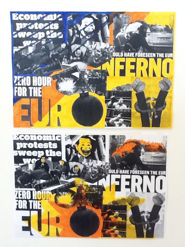
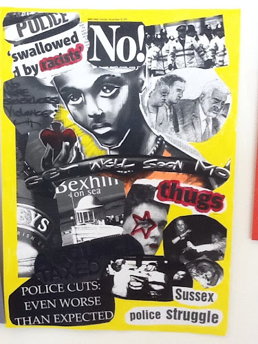
In this session we were looking at topical images in newspapers, following a theme. This relates to Warhol's years in advertising. A grounding that must have informed his use of colour and direct communication.

So we cut out a series of images relating to the theme of our choice. Out of these we made a montage about A2 in size, this was then photocopied and we worked into each copy with colour, bearing in mind Warhol's use of colour in the electric chair series in gallery 1 of the De La Warr Pavilion.

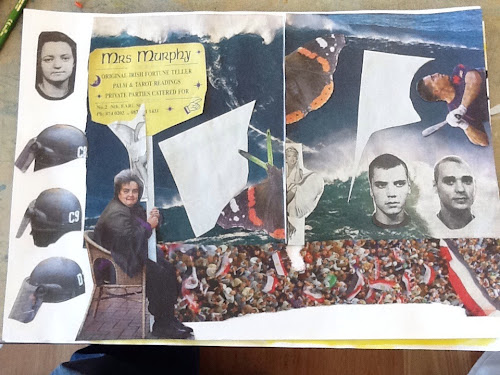
I chose threat and death, nice cuddly subjects! Inspired by the 90ft wave that a surfer successfully rode just off Lisbon. I read the article feeling physically sick with fear even though I knew he survived, a powerful story that i didn't manage to do justice to in the language of collage.

So the task was to think of a system for displaying images - ironically I forgot to come up with a system and just collaged them together, but of course I did actually have a system of a kind in my head. I do a lot of collage so am used to playing with images on a surface, balancing shape and form though have to say this was a bit different perhaps due to the time constraints but I think mostly to the fact that I have been used to working with abstract images not messages. Mmm gotta think about this and incorporate it into my work process.

This catches me at an interesting time in my professional development as I had a portfolio review last weekend and it is becoming all too clear that I have a magpies eye for the visual. I am someone who naturally finds it tempting to go in many directions and what will help me now is to choose a focus or more importantly let one emerge from the work that I have already got . To do this though I will have to stop and reevaluate and then test out what paths come to the fore. I think I might have been resisting this because I prefer to remain on the edges (where failure is less likely ) never quite succeeding because I haven't quite committed. So with the Big Flag public art project almost ready for take off I am going to have to do this very thing! coming soon a post about me as a flag pole.....

Communicating with the outside is hard enough but communicating with yourself is the trickiest.

How do I associate colour with the images.

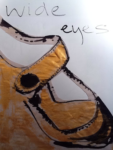
Select one of the images and draw it, I chose one of a massive crowd waving flags. I used black and yellow, thinking about the sense of foreboding a big crowd carries, danger, threat, unstoppable energy etc...

Picasso's guernika is a very powerful political message
Using a limited palate communicates more to the viewer.
More colours confuse the message

A Rolling stones face looks like a pink skull, what does this make you think of?

Images of women being nothing else other than beautiful not reflecting who they are.

Thursday 17 November 2011

If the shoe fits....

My shoe collection:

Checking out Warhol 7 - you can lead a shoe to water but you can't make it drink.

Checking out Warhol 7

Task: Make a shoe drawing with a comment then keep doing it as many times as you can with different shoes.

As Warhol had advertising in his blood there is usually a strap line for each drawing. He obviously loved shoes and what they represent, convey, how they make you feel, attachments, memories, associations, glamour, statement.

Look at how Warhol drew, biro, pencil, no perspective, flat, then compare the black boots in gallery 2 with the shoes in gallery 1.The shoes in gallery 1 are expressive and definitely convey something of perhaps the character of the person who would wear them, but not Warhol of course! I love the fact that everyone has a favourite pair of shoes...they are unique in our range of attire options they are rich in association and carry all the marks our wear and tear. They are often quite literally pounded with our personality. The paratroopers black boots in gallery 2 are heavy and appear shiny, very graphic black and white they are made to feel even more grounded by the paratrooper landing from upper left. They are polished for purpose and represent a nations combative pride. Not much change there then.

What is the personality of the shoe? Show somehow what is the shoe saying to you? Aha again one of these 'that sounds easy' instructions that defy all logic. It's fairly easy to convey something about the shoe but to get the image the marks the colours and some text that all work together is not something you can just knock out.

His dotted/blotted line drawings derived from Ben Shahn, he used paper hinged and then printed in sections before ink dried. This was his illustration technique for shoes whilst working as commercial illustrator at I Miller. A few of us tried this and it was moderately successful, our paper was either too absorbent or too repellant and the ink may have been a bit thin, however the process of attempting to replicate someone else's technique was interesting as what happens is you begin to experiment with your own variations.We got to experiment with ink and kebab sticks to try and replicate the genius at work! We made as many drawings and prints of each others shoes as possible in 2 hours, they were amazing! What also really helped was seeing other students trials and prints and then experimenting further.

As an artist work can be quite isolating so attending courses and actually working alongside others is a really useful way to broaden your ways of seeing. Inspiration is infectious when artists work together and even if people have very different experience levels there is always something to learn and take away, when we create we take risks and it's these risks that enable brilliant accidents to happen. Do you take enough risks? Do you choose your shoes carefully?!

Sunday 13 November 2011

Checking out Warhol week 6 how iconic is a cow?

Checking out Warhol week 6
Homework: choose a British animal and bring an image.

This was a practical session all through. We started by painting a strip of paper a typical Warhol-ish colour, I went for bright orange. Then we looked at the cow wallpaper in gallery 2

Gallery task:
Why the cow?
Draw a diagram, how does it repeat? is it mirrored, rows. Spaced out? Notice how many colours Warhol used, where is the image from, is it a photo or drawing? Are there any associations? How does it fit in with iconography with marylin or gilbert and george ? Making wallpaper: this was fun and everyone enjoyed it with some great results!

The cow paper repeats like brickwork (don't know the technical term!) he used pink and black on yellow. Keeping the cows framed so that you feel they have just turned round and seen you. There is a sense of movement and also stillness, I put that down to the rural tranquility of the idyll we think of when we see cows in the countryside rather than the hard work and constant functionality of the animal. Cows have been associated in art traditionally with lovely pastoral scenes Warhol breathes a breath of fresh farm air into the art world with this very functional product and non typical Subject matter. Giving the humble cow the icon treatment.

I chose a puffin.

There are loads of great works this week, but one worth a mention relating to last week is an embroidery made by Cheryl who is a fan of Louise Bourgeois this is her homage to Bourgeois.

Let's take a look in the Warhol wallpaper showroom 2011.

Sorry for the tardy post, it's been a heavy week for the Big Flag project. More to follow on that one!

Friday 4 November 2011

Warhol week 5 Text art - I'm a leonardo man

Warhol week 5

This is a very scant post I'm afraid due to lack of time the pursuit of an major art installation called the Big Flag is occupying all available time and energy at the moment.
So this week we were looking at Text based artists

I shop therefore I am, Barbara Kruger

Tracy Emin, Richard Long, Gillian Wearing.

Jim has a good Gillian Wearing story where he was walking home from work in the city of London one day way back in 1996 when he was stopped by Gillian who was staging a shot of office workers behind her holding a placard, saying ' I woz (robbed) censored ' he then appeared in Dazed and Confused #25 (very apt for Jim) with Gillian, that's him on the far right.
In the shot they used the male model who was used for the Levis ad that she was protesting about.

Text based art, as with most art, I found to be deceptively simple to look at but difficult to create.

Incidentally we have just found an article on Catherine Yass ( recently showing her work at the DLWP) in the same magazine!

Cheryl brought in a lovely Louise borgeous tea towel with the words 'be calm'

Tracy emin had a joint show with her before Louise died. Louise and Tracy both used embroidery. Richard Grayson

Bob and roberter smith political activist

Activity today is to
Listen to the tapes installation on the top floor.
Pick up a thread or theme note some key statements
Hang around listening to what people are saying.
Then make a text piece.
Think about visually how text will look how much lots or not.

These are some of my notes from the tapes of John Smith and Blutal/Taylor and then of overheard snatches of conversation in the gallery.

'Andy being Andy'
Act of taping
Keep it Andy
It's all a work
I got a really good tape
The thrill of a tape
Time capsules
Th act of acquisition
The tape is his wife
An appendage of himself
Capture collect genius obsessive
Thinking aloud
Conversation is richer than text
The darling of wealthy women
He was an artist above all else
Focus through the ears
Paranoid
The voice
oh wow

Overheard in the DLWP
oh I like that
I don't know a lot about it
I saw it on the news
Excellent
Interesting
I want to go upstairs
Can I count these to make sure?
I don't think it will fit in there
I'm a leonardo man
I wouldn't buy this